One of the abilities you get with the Oracle management Cloud, is the ability to explore all of the data points across all of the offerings. This allows you to use the data from multiple sources to not only analysis your systems, but also create dashboards for future use. In this example on how this can be used, we will pull up CPU and Network I/O for multiple database systems, to look for similar workloads.
To access the Data Explorer, click on the “Data Explorer” option from the OMC navigator.
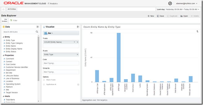
Next, you will see all of the Entity types, and sources of data. From here we can drill down, using multiple options… eliminating or including entities by Operating System, Location, Cost Centers and more.
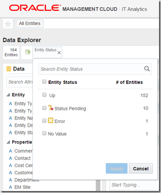
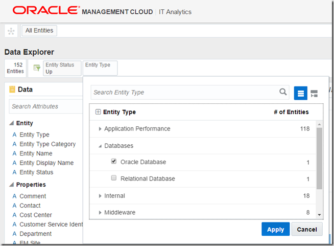
To filter, drag the field from the Data window to the Filter bar. In the example, I uses the Entity Status. Once the field is dragged, you should get a drop down that lets you pick what sub-categories you wish to filter on.
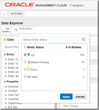
In this example, I am picking Entities that have an UP status.
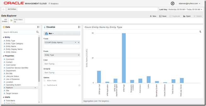
Once selected, the window will not update based on this filter. You can have multiple filter types, so let’s add a new data point to filter on, by dragging the “Entity Type” into the Filter bar.
Since we have multiple type to select from, 118 at the time of writing, scroll down until we get to Databases, and then selecting Oracle Database. As a note, non-Oracle databases are also supported!
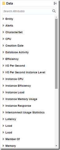
Next, once the Entity Type is filtered, we will get new data to filter from. This is based on the Entity Type, so for Databases we will see Database specific metrics like instance CPU and Instance memory usage.
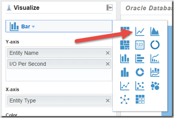
For this example, let’s select I/O per second, and drag this field to the Y-Axis.
And since I want to see performance data, let’s select the graph type to something that works better for throughput information, like the line chart.
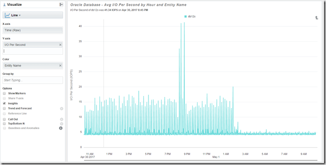
Now we will see the graph populated with this information
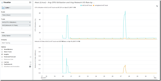
We can repeat with additional fields in the Y-Axis, so both Network I/O and CPU utilization are graphed. We also changed the Color to be based on the Entity Name, so each Entity will be represented by a different color. This was done by dragging the “Entity Name” fromt he Data window to the Color field in the Visualizer.
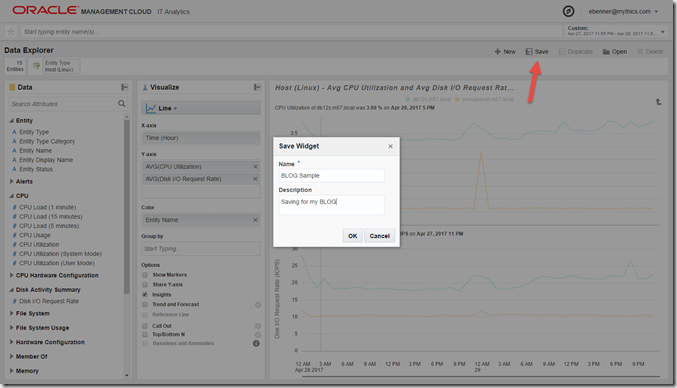
From here you can easily see the relationship between the entities, with similar peaks of network I/O and CPU at the same time periods. Finally, you can save the report for future use , by click on “Save” from the Data Explorer, and giving it a name and description.
This can be later opened, by selecting the Open option. It can also be used on dashboards.
Hopefully this showed you a few of the tricks using the Data Explorer. it’s a powerful tool, that lest you quickly examine and analyze data from your environment.


Erik, good example of using OMC to evaluate how many entities of each type you have and very quickly set it up and by saving the dashboard, very easily review as needed. Thanks!