Once of the many overlooked abilities of OEM is the ability to view and graph historical data from the targets. With OEM, as a general rule, if it has a metric, you can not only build alerts, but you can also graph the metrics for a target,and end add multiple targets on the same graph for the same metric. You can also easily export the data into a csv file if need be.
This works for all of the metrics for a target, which means for something like a database target, you can pull not only the CPU, memory and IOPS data for a sizing exercise, but you can also graph database metrics like Parse failure counts, full index scans per sec/txn, enqueue metrics like request, waits etc., and even metrics like user commits per sec/txn.
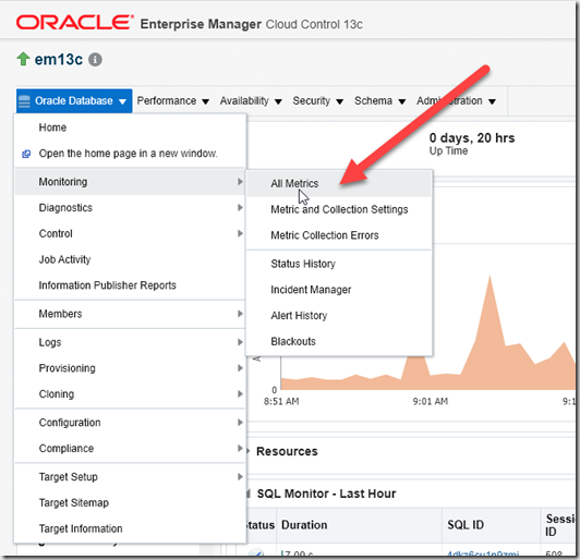
To do this, navigate to your target, and then head to the target menu->Monitoring->All Metrics;
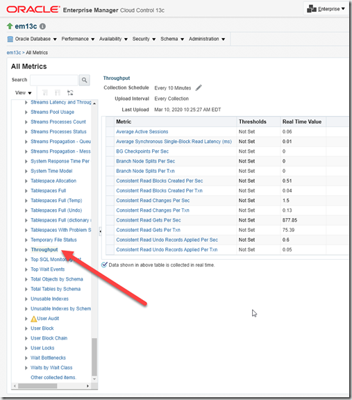
From here you can see all of the metrics available for the target, but keep in mind, while the metric is showing, if it is not configured to collect data you will not be able to view the data. Not all metrics are collected by default.
Lets start by looking at the database throughput metrics, from the list of metrics, scroll down the throughput, and the select it.
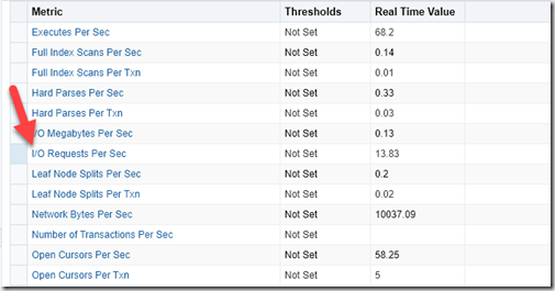
Here we will see all of the throughput metrics that we have data for, as well as the Metric collection schedule for these metrics, in this case every ten minute. As you scroll through the metric list, you can also see if any threshold have been generated for the metric. In this example, select “
I/O Requests per Sec”
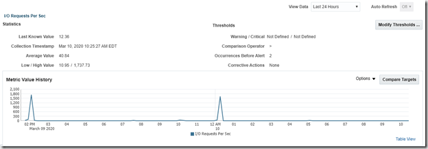
The system will no graph the IOPS from the database, with the default view of 24 hours. It will also show the low/high and average value for the metric.
You can also see when data was last collected, and if any corrective actions are associated with the metric. In this case, we can see a peak of 1737 IOPS, and that was either around the 2pm or 12:15am windows. You can mouse over the graph to see details for that specific time.
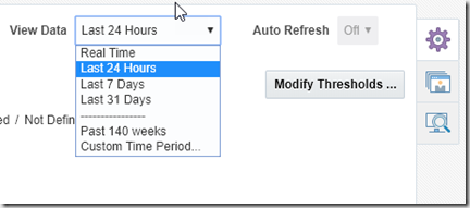
You can also change the time window used, by selecting the time drop down in the upper left hand of the window.
This allows you to specify a time window, or a specific start and stop time using the Custom Time Period option. This is helpful when looking at sizing of a system, as you can specific a custom period for as long as OEM has data.
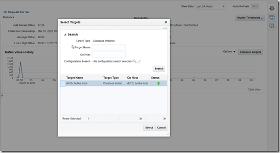
It is also possible to graph multiple systems on the same graph. Simply select “Compare Targets” , and select the other targets you want on the graph.
You will then have a graph with each target getting a different color. You can the mouse over each color li for the specific details for that time window. Optionally, you can mouse over the target name to highlight that target.
In this example, I hovered over “db12c.bubba.local” a mostly idle instance at this time window.This is helpful to show systems that are buried by more active targets.
Exporting data can be done when showing only a single target, by selecting the Options drop down,
Then selecting the “Export Chart Draft”, a CSV file will then be downloaded.
Take some time, and explore the other metrics. There are thousands of them in the system from OS CPU and network metrics;
There are also WebLogic metrics like JVM Heap usage and Cached Statements not Used and more metrics.
Every target in OEM has metrics that you can use this to graph and compare the data between like targets.
As a side note, OME 13.4 is now out, if you have not upgraded your OEM to 13.4, you need to spend a few hours to do so. Plenty of new features in 13.4 that make it worth the time.



Thanks, Erik. Good post on graphing, as well as the new 13.4 release. What are your thoughts on 13.4?